…and that goes for the county as well.
This moan (because that’s what it is) is about expensive reports being commissioned by organisations, presented at a meeting, and then left to gather digital dust on virtual shelves. While I don’t expect the general public to read the reports or the meeting papers concerned in depth – the last Greater Cambridge Partnership pack came to over 400 pages, the data maps and diagrams are much more understandable to the general public. Let’s take this one on the proposed sites that landowners in and around Cambridge said are available for development.
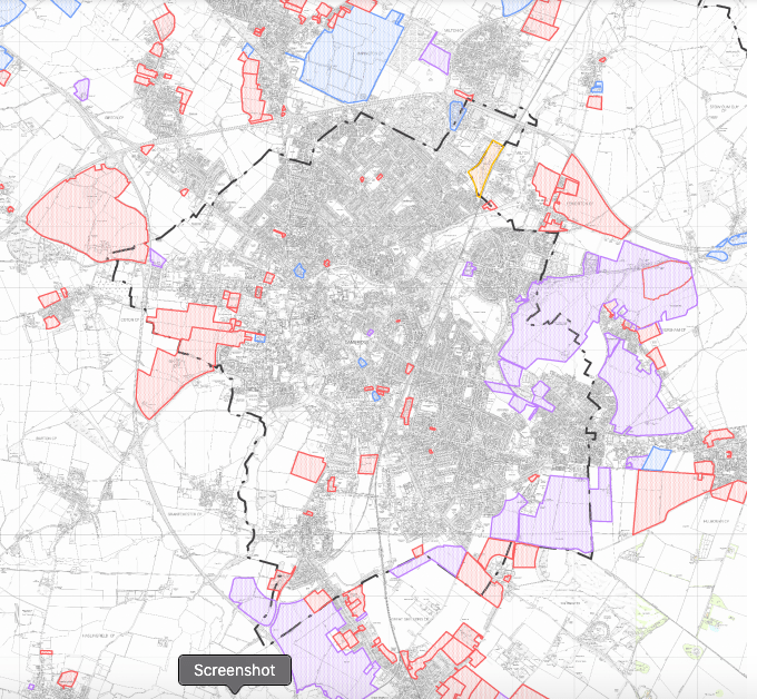
The above-mentioned map is from the Greater Cambridge Planning site here. The red blocks are sites suitable for residential only, purple for mixed, and blue for industry.
“Don’t we have somewhere that people can find all of this stuff?”
In principle, Cambridgeshire Insight carries out part of this function, being about data & statistics on the county, and is an incredibly useful tool for researchers. But as with many public sector-funded knowledge bases, they are underfunded and under-appreciated in terms of what they do, even though and as with the Cambridgeshire Archives, if more people knew about them and what they did, they’d be more valued and appreciated by people and politicians alike. My public Q to the Cambridgeshire County Council in 2017 confirmed that the libraries and archive service is being funded at its statutory minimum. (I had fewer grey hairs back then!)
Why the information and knowledge base matters
Cambridge is changing. Cambridgeshire is changing. Therefore in order to facilitate informed debate about what our future should be, we need to have a common set of documents from which to work from. Bearing in mind that most people don’t have the time or the head space to commit to the sort of analysis that such things really could do with, it’s all the more important that the visual depictions of what is proposed are somewhere that the public can easily find, and respond to them. Hence sharing https://www.writetothem.com/ to anyone complaining about something to do with local services.
With the various back-of-the-envelope changes to the machinery of local government (and we’re expecting even more, just not the overhaul that is actually needed in my opinion), it isn’t nearly as clear as to which geographical/spatial level we should be talking about. Are we talking about the City of Cambridge as per the boundaries set before the Second World War? Are we talking about this concept of ‘Greater Cambridge’ which appears to be Cambridge and South Cambridgeshire? Are we talking about Cambridgeshire County the historical – which is Cambridge and the Isle of Ely but not Huntingdonshire or the Soke of Peterborough? Or are we talking about Cambridgeshire as defined in the restructure of local government in the mid-1970s?
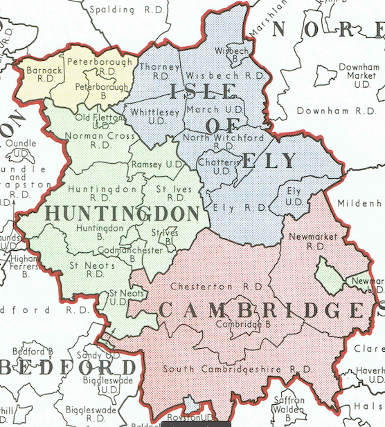
Above – a snapshot from A History of Local Government of Cambridge in maps. Actually it’s called something more wordy than that, and it was published in the 1950s but that is what it effectively is. I’ve uploaded the document (51 pages) to the Internet Archive for the public to see. I’ve also scanned and uploaded a number of other ones as well – see here and have a browse.
Sometimes images jump out at you and you want to know more about them – such as this one from the CEG firm that owns various tracts of land around Cambridge and lobbying hard for Green Belt designation to be removed so they can build on it.
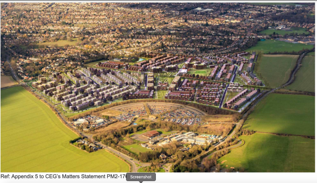
Above – this was picked up by the Federation of Cambridge Residents Associations here in their May 2017 update, linking to the CEG’s vision document for South East Cambridge 2013 which you can read here. And it’s a slick document reflecting the amount of wealth they have invested in the land. The problem – not just with them but with developers generally is they will fill their brochures with photos of old housing, describe how wonderful it is, and then fill their own developments with buildings that all too often is described as bland, identikit, could have been built anywhere.

From p32 of the same document, sampling existing housing types (Rathmore Road, New Square, Park Parade) before producing a vision of housing types that looks nothing like any of the above, as the CGI indicates with boxes all with flat roofs. (The above-three all have pitched/angled roofs.
The big pitch – a new country park in return for the right to develop across a swathe of South East Cambridge
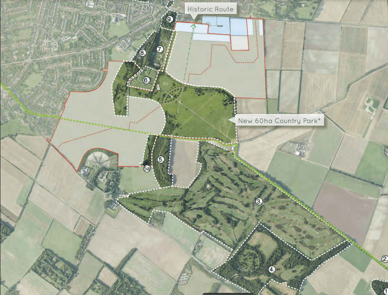
Above – from page 27. Note this was produced seven years before the Corona Virus outbreak, and the public finding out that they value green open spaces much more highly than politicians and developers first thought.
Cambridge Great Park proposals.
I could stare at this map all day by BCR Infinity Architects here.

The proposals were described in more detail by Alex Spencer of the Cambridge Independent here. Inevitably things are probably on hold given the state of the world for now. But this would be another example of proposals that should have a much higher profile and ones that the public can return to as and when.
Important historical documents that shaped our city
One of the things on my big list of things to do is to digitise by Davidge’s Cambridge Regional Plan fo 1934, and the Parry Lewis Report from the late 1970s – the latter who came up with plans to double the size of Cambridge from 90,000 to over 200,000 – far exceeding the 100,000 limit set by Holford and Wright’s Cambridge Development Plan of 1950.
The Holford Wright Report of 1950 Vol 1. has been digitised by Cambridge City Council and is buried here. https://files.cambridge.gov.uk/public/ldf/coredocs/RD-STRAT/RD-STRAT-430%20p1.pdf
As you can see, not the most visible place to find it. I wrote a short blogpost on the report here for Lost Cambridge.
Documentary Libraries
The Greater Cambridge Planning Service is putting one together for the next local plan, but inevitably it’s not covering the transport parts. The separation of the Greater Cambridge Partnership – formerly the City Deal, from the Cambridgeshire & Peterborough Combined Authority that was created two years also makes things more tricky trying to keep up. It was only by accident that I found the some very important analysis on the future of East Cambridge.
Cambridge Eastern Access – Engagement Summary Report August 2020
I was one of the people who went through the detailed exercise online picking out as many bits in my neighbourhood that I thought could be improved. Therefore I was waiting with interest what everyone else had to say.
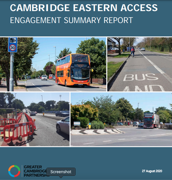
The problem is that the report above ***is buried in a set of meeting papers*** from the Greater Cambridge Partnership’s Board of 01 October 2020 <<– Click here, and then click on 1) Agenda Pack (download note, it’s 32MB.)
It’s not until you get to page 219 that the report emerges.
Now, for the hardcore community activists with a background in the social sciences (or with any educational, academic, or professional training in analysis for that matter), there is *lots* there to analyse. Tables, graphs, charts, maps, the lot. But with so much there, it will be far too much for people who do not have the educational attainment or aptitude to process that large amount of information written for that audience. Yet these are things that will affect their day-to-day lives, so they have a right to be consulted and give an informed opinion. It is the responsibility of the public bodies to enable them to do that – and that means presenting the information in a means the the majority of the public can access and understand. Let’s take an example: P277 from the Agenda Pack, we have another report – the options appraisal report.

From the analysis in the report above, we see a data map of traffic vehicle flows at the PM peak on major roads in East Cambridge. The A14 in thick dark green stands out. Zoom in and in the bottom left you can see Barnwell Road and in bright green, Mill Road.
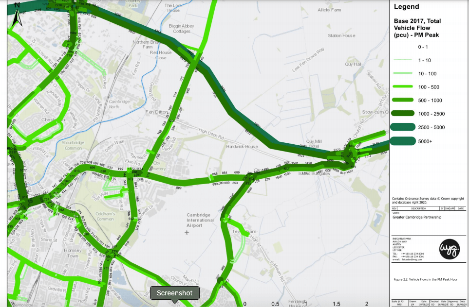
Above – traffic vehicle flows at the PM peak on major roads in East Cambridge. ***This is really useful information to know for local area committee meetings*** – and it gets better. The data map below tells me where the traffic jams are most likely to be in the afternoon rush hour.
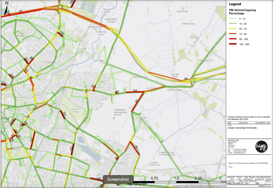
Above – capacity of roads during PM Peak. (See p294 of the Agenda Pack).
For those of you that have been to South Area Committee meetings of Cambridge City Council, rat-running by vehicles by the Coldham’s Lane / Cherry Hinton High Street junction is a continual complaint. The map of the PM peak illustrates this perfectly – see the detail below.
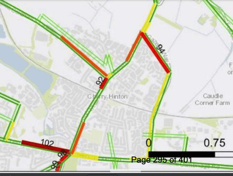
With the junctions highlighted/labelled ’92’ and ’94’ – indicating the percentage of the capacity the junction is operating at, it’s not surprising it jams up and thus motorists use the rat run – so many that it’s actually picked up by the sensors!
But where are these maps being made available to local residents in Cherry Hinton in a form that’s accessible and easy for them to find? Bear in mind the demographics of Cherry Hinton as well – a strong mix of elderly residents and young families. There is no ‘one publicity solution fits all’ model.
The general principle I run with is to put notices and things where people are waiting and have time to kill – appointment rooms, bus stops, railway stations and so on. Obviously the pandemic restrictions demand a rethink. But given the extended time frame involved with planning and transport, can we spend some of that time on this?
